Lost The Dot Plots
During and since the global financial crisis the Federal Open Market Committee (FOMC) has done a remarkable job in navigating the US financial system under extremely challenging circumstances, setting the standard for other central banks to follow.
Apart from the economic data, the most obvious indicator of the Fed’s policy success is its progress in the ‘normalisation’ of monetary policy, specifically the end of quantitative easing and the gradual raising of interest rates. We have commented on these in numerous blogs.
One of the last stages of ‘normalisation’ we debated at our May asset allocation meeting was the possibility, and possible effects, of the modification or withdrawal of the Fed’s famous ‘dot plots’.
As a quick reminder, the dot plots are published after each FOMC meeting and show each of the 16 members’ (anonymous) projections for the Fed funds rate at various points in the future. Below is a graph of their latest projections:
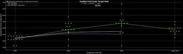
At this late stage of the cycle and the path to ‘normalisation’, the utility of the dot plots is being understandably questioned. Like it or not, the dot plots send a powerful message to markets, but what if rather than navigating the economy and markets towards a stable desired path, they actually sow the seeds of disruption?
Recently the dots have highlighted the potential for a flat or inverted curve in the next 12 to 18 months, raising the prospect that the Fed may actually be creating recessionary conditions. Similarly, if the dot plots were to show a future fall in rates that in itself would be taken as an indication that the Fed believed a recession was on its way. Does the Fed want to effectively publically predict a recession? Clearly neither scenario is helpful!
Finally, while the Fed has always correctly stated that the path of rates is data dependent and the dot plots are no guarantee of future actions, one could easily see the dot plots getting behind events (particularly at times of inflection or volatility) which could bring central bank credibility into question. From the Fed’s standpoint at least, the dot plots could be approaching the end of their usefulness.
We would not be surprised if the Fed was to shorten the forward time period for which the dot plots are produced, modify the guidance tool in some other way, or ultimately abolish them altogether. This may create some short term uncertainty (a dot plot tantrum would likely be much milder than the ‘taper tantrum’ of 2013), but historically it has not necessarily been the Fed’s job to inform markets of its actions in advance. Such a move should ultimately be viewed as a further sign of successful normalisation.